
NORFOLK, Va. — Author's note: The video above is on file from a separate weather explainer that aired on July 27, 2022.
If you are a long-time viewer of 13News Now, you may have noticed some recent changes to our weather maps and the way we display weather data.
As the 13News Now Director of Weather Content, I am always evaluating our weather presentations to make sure our message is clear for each and every one of our viewers.
After all, it doesn't matter if we have the "Certified Most Accurate" forecast in Hampton Roads if the message we deliver isn't clear.
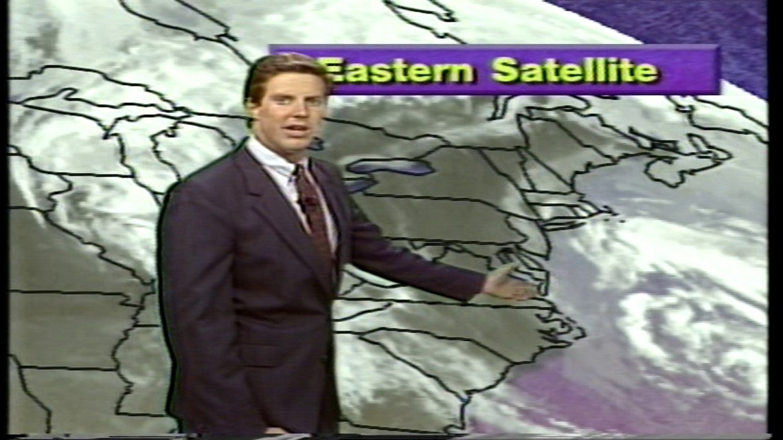
From a visual standpoint, weather graphics have evolved greatly since Chief Meteorologist Jeff Lawson started in the business.
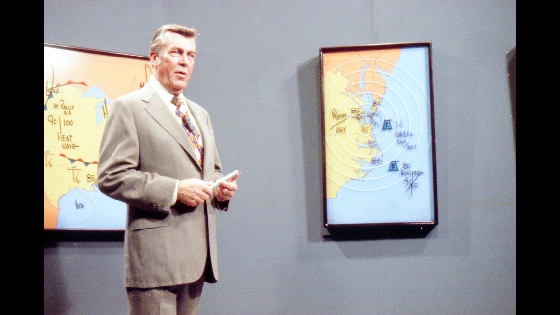
His first weather reports utilized magnetic suns, clouds, and numbers stuck to a painting of the region. Fronts were drawn with a paint pen, on a map, covered in plexiglass.
And I know many remember Joe Foulkes and his trusty pen and snappy salute. He always could draw the BEST arrows!

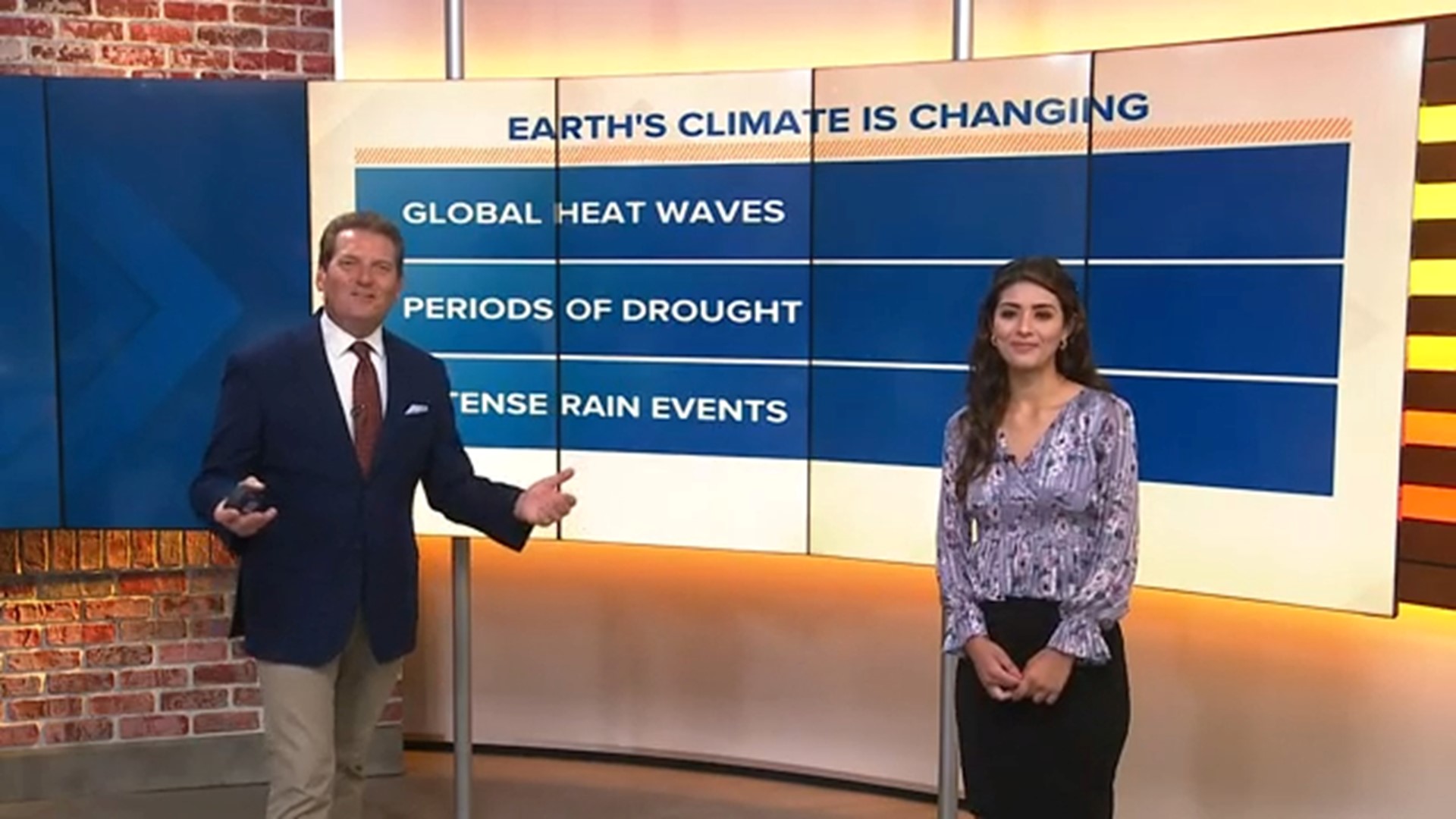
Times have certainly changed since then! We now have computers that can give us three-dimensional views of a thunderstorm.
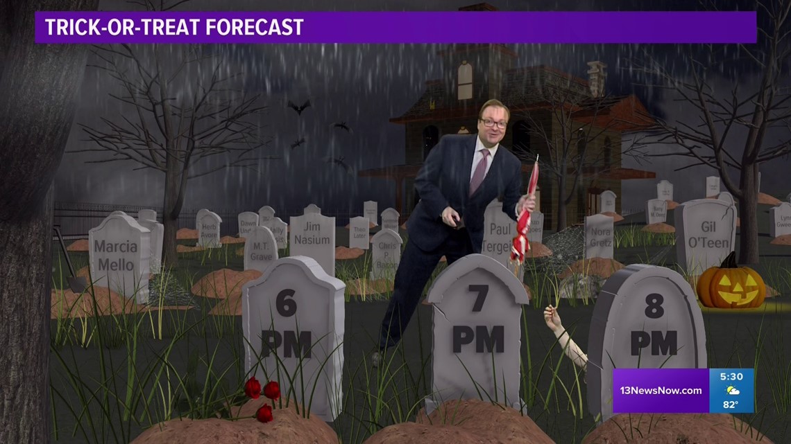
13News Now was one of the first stations in the country to use augmented reality in our forecasts, allowing us to literally put ourselves in a virtual graveyard to deliver a Halloween forecast.

Over time, our maps have become more detailed as well. I remember, as an intern, using a map book and the copy machine to hand-draw maps on the computer to scale.
Now we have maps that come from satellite, where we can see mountains and valleys, realistic water that ripples with changes in the wind, and atmospheric effects that give a haze to the horizon.

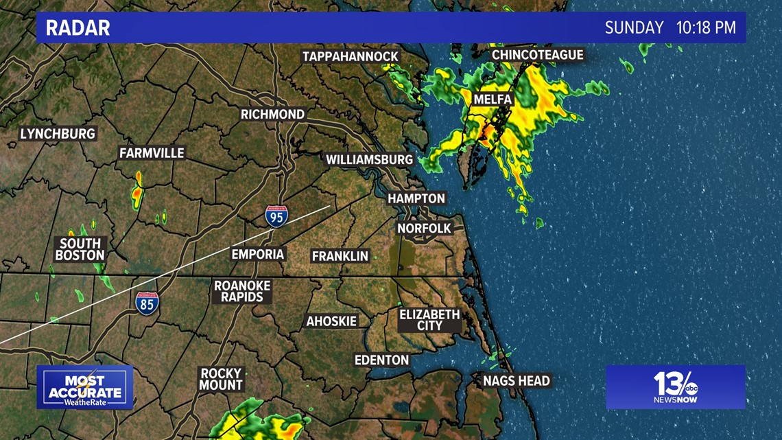
While these detailed maps are nice and fancy, a recent survey found that all these enhancements have made our maps more difficult to read. Compare the above map to the one below. On which map does the rain, the reason we show the radar, stand out more?

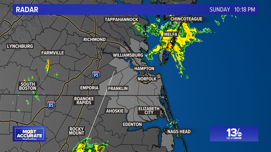
I think most would agree the rain shows up much better on the second, simpler map.
And if it looks familiar, you're right! It's almost a throwback to the 1980s and 1990s, when Dr. Duane Harding and Jeff Lawson used brown and gray maps as well.

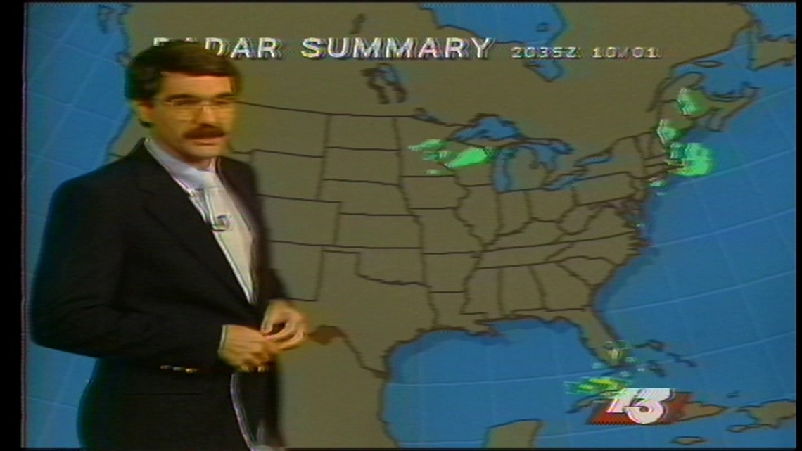

Granted, back then, it was due to the limited eight-bit-graphic capabilities of the weather computers of the day. Sometimes less is more, and our goal is to make sure the most relevant and important information is front and center.
One other change we are making concerns some of the colors we use on our on-screen maps. According to the National Eye Institute, nearly 10% of the population has some form of color vision deficiency, or CVD.
In most cases, red and green cause the biggest issues. In fact, I have some color vision deficiency myself. While not totally "color blind," those bubble-numbers my optometrist shows me every year at my eye exam give me fits!
So, you will be seeing a little less green in some of our maps. We have transitioned from the traditional "rainbow" color palette below...

...to a CVD-safe palette.

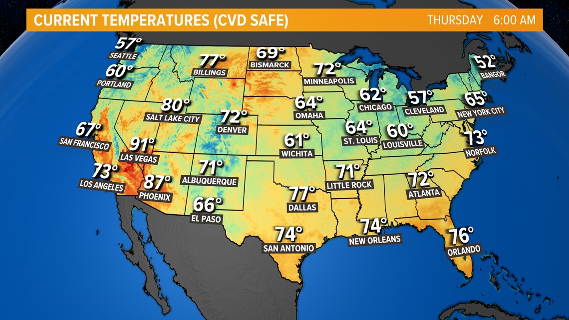
The traditional radar colors will not be changing, as those are so well-recognized that changing them would be tough.
But some of the color palettes for temperatures and other weather variables may have a little less green in them. As Kermit says, "it's not easy being green!"